
Configuring buttons for getting responses and for providing follow-on information
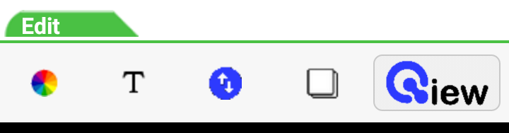
The Edit Bar's last editing button is the ButtonsButton.Tapping it replaces the Edit Bar above with the Buttons Bar.
These buttons provide simple ways for the receiver of your document to get more information and/or to respond to your message.
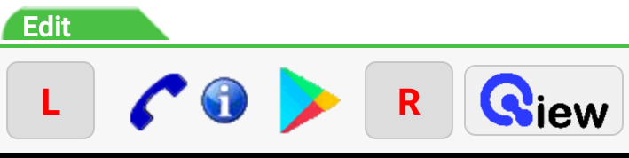
The Left and Right buttons at either end of the bar can have label text and colors assigned as you wish. The buttons grow to fit your labels.
These Response buttons can be set to link to any URL you wish to connect the viewer to additional web resources or to respond as you need.

The Call Icon will appear on the received message if a phone number has been associated with it. This is an easy way to provide your receiver with direct contact with a call center.

The Information Icon is also optional and can connect to any URL. You would want it to be an easy way to reach a particular landing page associated with the information you are distributing.

The Play Store App Icon appears if you provide information about your app. If it is installed on the phone this icon will be replaced by your app's icon. If it is not, the icon will link directly to your app entry on the Play Store. This makes it very easy for your viewer to download and install it. If your app data is not entered, this icon will not appear.
Finally, the Qiew button will preview your document so you can view your choices and test their workings.